2021-07-24
javascript
react.js
next.js
Every full stack developer would need to implement file uploads, downloads and access control at some point in their projects. This handy guide explores implementation of all aspects of file management, with part II focusing on UI and client side things.
Every full stack developer will have to implement file uploads, downloads and access control at some point. On the client side you want to fetch, upload and delete access to files, based on access, in a system dealing with files.
In this article, we shall cover how to handle the client side stuff for file uploads and downloads. In Part I of this guide, we covered how to model the data and implement the backend for file management. This is targeted at an intermediate level front-end developer audience, A prior knowledge of Javascript, HTML/CSS and React is expected.
Part II: The Frontend
On the front-end side of things, we'd want a control that displays files, loads them whenever accessed and allows file deletion. We would also need a control to let the users upload the said files.
Using react, we're going to create reusable components for both of the above, starting with a file display container. We will be following the file meta structure covered in Part I of this tutorial.
Setting up File Display
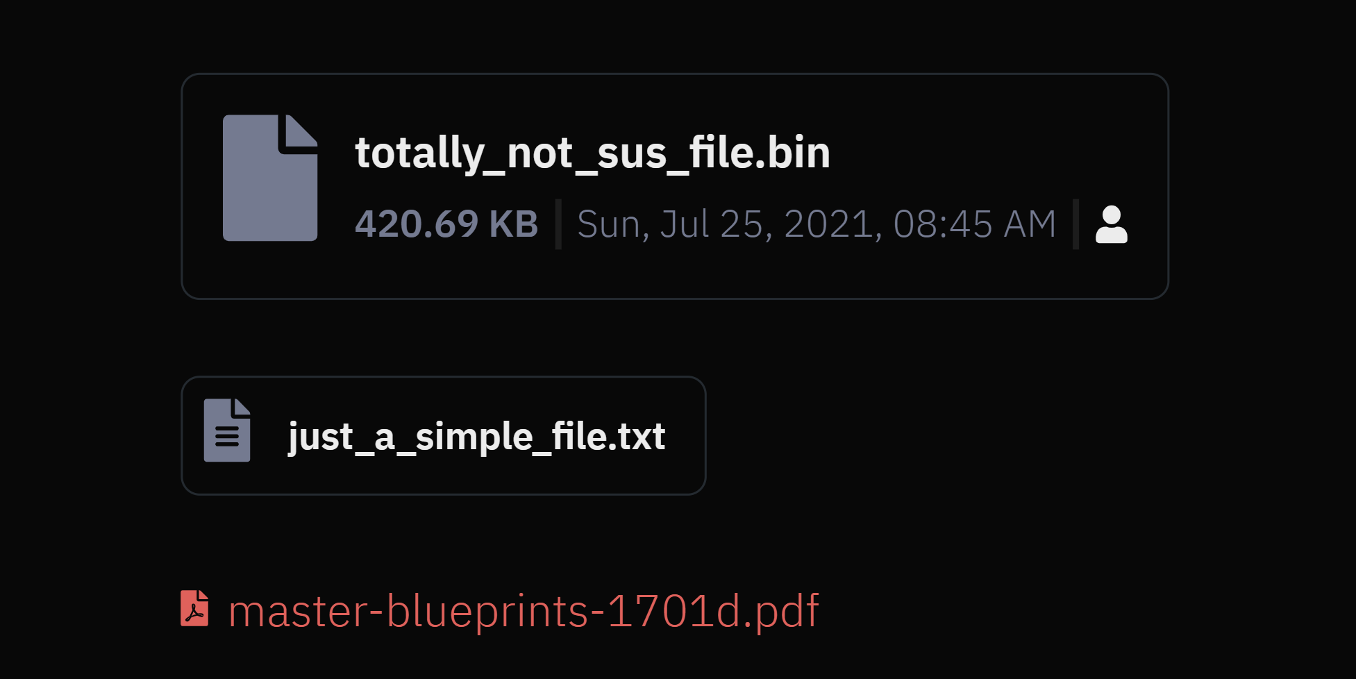
If we're displaying file links inline, we could just display the file name and link it to the file. If we take a more tabular or card approach, we should display a little more information about the file itself. Based on our example file data model, they could be:
- file name
- mime type (best displayed with an icon)
- file size
- creation date
- uploader
- type of access
Let's create a component that takes in these properties. We'll feed it stuff
Where file is the file object following the schema, containing { name, path, size, mime, date, desc, uploader, access, etc. }. Ideally it'd be type-checked with typescript, but we're keeping this example simple.
Properties can also be passed directly to the component, this is especially useful when using the component with the FileUpload control, as we don't have a formed file object.
Properties small and inline change how the control is rendered.

Accessing and Removing Files
Now we want to add a utility function that opens up the file in a new tab. For buttons and links we can just refer it to the href tag, but for customized controls we'd have to create a function to map to the onClick event.
Since we're generating the access links to the bucket on request, we're actually calling our API instead of the bucket URL.
We also want to optionally support deletion within this component. This will be done by using the onRemove prop, which, if present will allow the component to support file deletion. Let's add a helper function to delete the file.
First we'll need a state variable for UI updates while deleting
Now for the file delete helper function, we'll call our delete endpoint which removes the file from the bucket and triggers the callback to be handled by the parent component.
Next, we need some icons to display based on the file and access type. We can create a utility function to return us the icon from a list of preset icons (e.g. FontAwesome) and map it to the mime value. E.g. an application/pdf mime should have a pdf file icon, images should have an image icon, etc. Similarly, icons for the access note can be based off private, group, organization and public → user, users, building and globe icons.
Display Component Variants
Let's setup our renderer for the variants of the component.

If inline, just return a standard link.
Else we'll render the component in either full or small variants.
Where getFileSizeTextFromSize is a utility to get readable sizes from bytes.
And formatDateTime returns formatted locale time from an ISO date.
Modal launches a confirmation dialog, which performs an action on button click.
That should be enough to setup a component capable of displaying and removing files. Now we have to allow the users a way to upload files. Let's make a new component for that (yay! /s)

Accepting Uploads
Again, there's various ways of achieving this. But in essence, a reusable FileUpload component should have the following features:
- Accept user files using native file picker modals
- Accept user dropping files into a container
- Accepting selective files (Not all files, not all sizes, depending on the application requirements)
- Upload files to the server
- Display uploaded files and uploading states
- Support multiple files
- Support file deletion
With these in mind, we will be building a simple select/drop solution that can upload files to the bucket (by getting an access URL from the server, as described in Part I).
We'll build a component that accepts a single file, display uploading, error, and invalid states.
Let's start by defining states in an "enum".
Setting up FileUpload
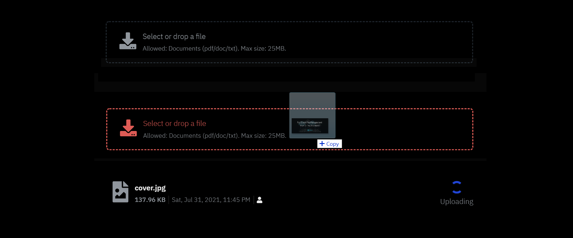
Let's define our FileUpload component and the properties it can take up. Our component is going to look and function like:
Where title, icon and subtitle define what's displayed on the control.
disabled disables the control whenever required by the parent (e.g. loading data, etc.).
uploadPath = ['path', 'to', 'location'] determines where the file must go into the bucket. We're following the scheme discussed in the backend for this, where, for example, ['account', 'profile'] means the file will be uploaded to /organization_id/account/profile.
onChange and onRemove are callbacks called when a file upload or delete is successful. Error and intermediate states are handled by the component.
allowedMimeTypes = [] contains a list of MIME (document) types supported by this control. DEFAULT_MIME_TYPES is filled with document types such as application/pdf, application/msword, text/plain, etc.
maxSize (bytes) determines the maximum size of files accepted by this control.
dropProps, containerProps and fileContainerProps contain additional props passed down to the containers or drops.
Upload States and Functions
Great, now that definitions are ready, let's setup state variables. We'll use one status variable to determine the status of file in the control. A separate dropStatus to control the status of the drop box (the part where the files are dropped into), A file variable to store the information of the selected file, and one error variable to store and display error information.
Let's define the function uploading the file cloud. Note that this component only accepts a single file at a time. The javascript callback for file selection emits a list of files.
Once we've established a single file is dropped on to the control, let's validate the file for mime types and size. This can also be done during the dragging callbacks, but we also need to support native modal inputs.
Next, we update the file object and the status variable.
Now we just need to request an bucket upload URL from our server.
And another helper to handle file deletions (when the current uploaded file is removed).
Great, now that files are ready to be tackled, let's code in the methods to support dragging and dropping.
Handling Drops Inside a Container
To support dropping into the container, we need to implement four methods for the event types dragEnter, dragOver, dragLeave and drop catering to when the file is dragged into, over, outside, and dropped onto the container.
onDragOver is overridden to prevent browser to overriding drag over events.
onDragEnter is called when a mouse with a draggable item enters the drop context.
And we need to reset the UI states when a draggable item exits the container. onDragLeave is the event called in this process.
Now for handling drops within the container, we implement the onDrop method.
Now, we just need to setup the UI for this control.
FileUpload Interface
Since we're only allowing one file per instance of this component, we only need to display the drop container when the status is NOFILES or ERROR. Our drop box should look like this:

Without delving deep into the CSS and all, what we want to do is change border colors depending on the drop status, handle component wide disabling, implement drag and drop methods, and it's onClick counterpart. So, something like
Where fileInputRef is a ref to a hidden input to handle native file modals onClick.
If the file is in the uploading state, we can use the file display component in disabled form with a spinner. Remember, our display component also handled deletion.
Finally, we can display upload errors either in a modal or as a text.
And that should be it for a reactive interface of file uploa...
Wait, how do I do multiple files?
Ah, yes, right. To implement file uploads for multiple files, we can either handle drop and selection for multiple files at once, or re-use this component in a wrapper capable of handling multiple files - Something that displays the upload control again once a file has been successfully uploaded and emits an Array to the parent component. You could also update the backend to support link generation for multiple files at once, or use a different technique all-together, but that's beyond the scope of this tutorial.
Conclusion
Welp, this should cover some aspects of how to display files, design and implement file uploads, and
Wew, this was a long tutorial, way exhausting than I'd thought it'd be. Thank you for reaching the end. Hope this has helped somehow.