2021-08-08
react
svg
components
Vector graphics can be used as React components allowing extensive customizability by means of props. Here's how to create a SVG component in React.
SVGs as Components in React
Vector graphics (SVGs) work beautifully within React. They can be directly rendered when returned from within a react component, or turned into a customizable standalone component for use elsewhere.
For this tutorial, we're taking a vector of Cardano's logo available from cryptologos.cc.

We want to create a animated pulsating loader with customizable colors with the cardano logo. Let's setup a blank React component with the relevant props.
Getting the SVG to work
Now we'll paste the svg inside the renderer. Since React JSX does not support any xml properties, we'll strip our svg of those.
The width and height properties in the svg will define the actual size of the svg. We've put an container outside it to align it to the center of the container.
Note that the actual view box of the svg specifies a different size (and a different ratio too!), that's the size of the actual svg master file in it's original aspect. When we specify the width and height, it scales the vector while keeping the aspect ratio. We've opted to keep the height constant, while maintaining the relative width. This allows the svg to expand to a max size of 512px while auto-adjusting the width. You can keep width (or both) constant as well.
Your svg definition inside the component should look like this.
Since we want component to control the colors, we're going to remove the (also unsupported in JSX) inline style from the svg (.st0 { fill: #0033AD; }) and instead putting color directly into the paths themselves.
For example
An optimization will be to add fill properties to groups (<g>) in the svg.
If you've done everything right till this point, you should be able to have use the component elsewhere. Try it out!
Grouping
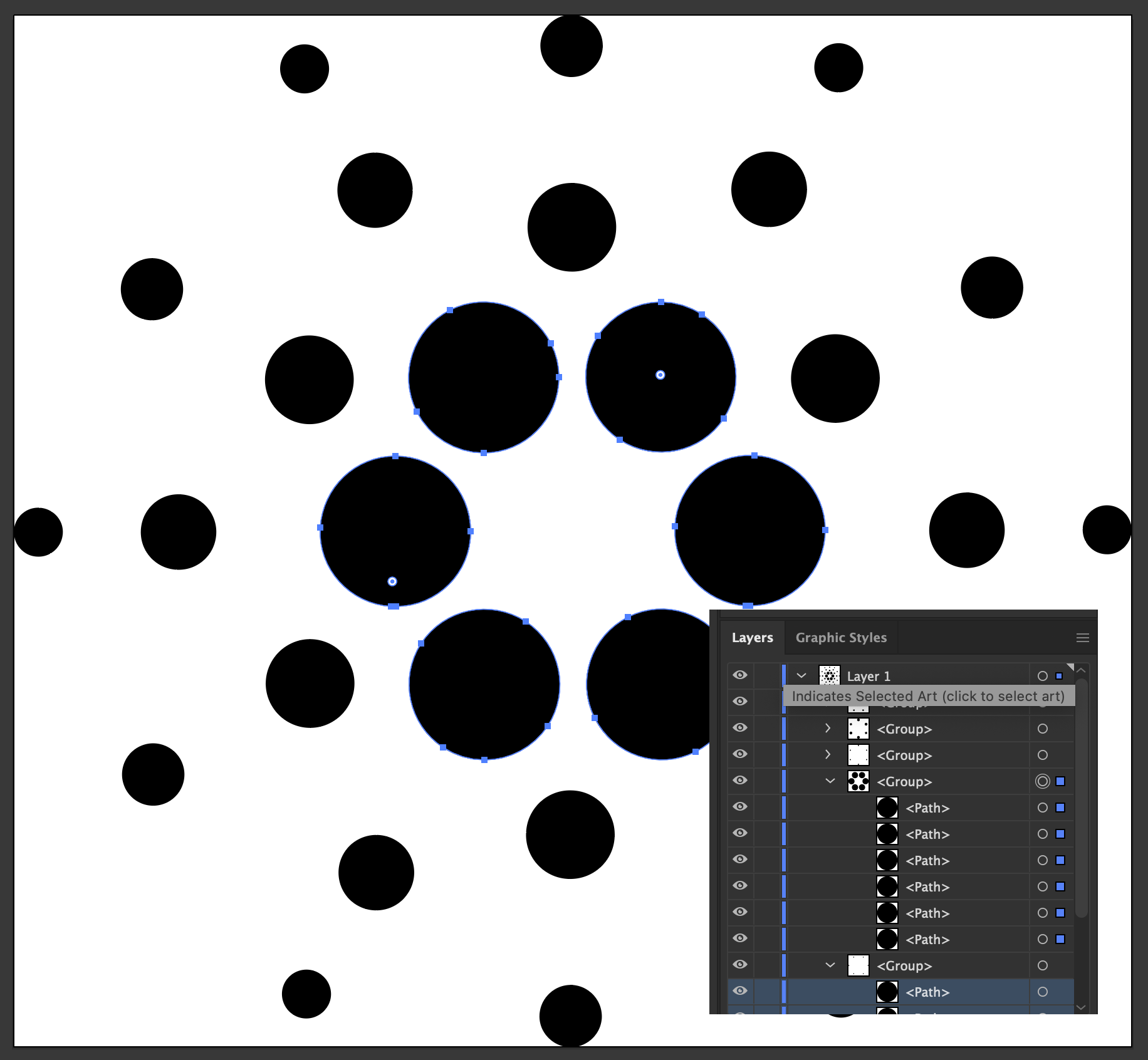
We want to do a pulse animation emitting out of the center, so we'd want to group the five circular-hexagonal groups. One way of doing this would be in a vector editor like Illustrator where you can select and group.

Or you can manually show and hide items in the component to identify which paths belong to which ring, while cursing the designer who made this. Fortunately you can get an svg with grouped rings here.
If you've updated your component with the groups from the svg above, add color prop opacity value decreasing from 1.00 to 0.20 to the groups (ring-0 is the inner most ring). It should look something like this
and appear like this

Animating
There are many ways to go around animating it, the simplest being using a state variable to control the opacity on a timer (yay, more javascript!). Alternatively we can use css key-frames to animate the groups. This is what we'll be using for this tutorial. We can customize the css within React is using inline styles, styled-jsx multiple css classes, multiple conditional statements, or what we're using in this tutorial, styled-components.
Let's define the container div for our svg with styled components.
We want to have two customizable properties for this animation, duration (overall) and delay (between rings). So let's update the component definition as such:
Let's update the container div, it should look something like this.
Since we'll be controlling the opacity of the svg groups from the css, strip them of the opacity prop.
Let's define our animation in the css:
This will reduce the opacity from 1 at the start of animation to 0 at third of way, and increase it back to 1 from two-thirds of the way. We'll also need to add the same keyframes for @-webkit-keyframes, @-moz-keyframes and @-o-keyframes for maximum compatibility.
Let's define how the animation will affect the groups. Inside the styled css, add
The animation pulsate defined in the keyframes above will be applied to all groups <g> within the <svg>, with the duration as specified in the component (2s by default), 0s delay, on infinite loop, with ease-out animation.
You should already be seeing the effect of this. The whole logo should be blinking in and out, given you've passed the animate prop to your component's render.

Let's add delays to the individual rings.
Starting with ring 1 (No delay for ring 0), we're adding incremental delays till ring 4 has a delay as specified in the props. This should have the effect of blinking the rings one by one.
Let's add a subtle scaling effect to the animation to give it a more kick.
Uh-oh, it's scaling weirdly! That is because by default css transformations have their origins at (0, 0). Change the group's transform-origin to center.
That's it. You should have a simple animating, customizable vector logo in React by now.
Scope for improvement/enhancement include a better timing function, calculated percentages, color changes, animating individual paths, converting <path> to <circle>, different transforms, etc. However that is beyond the scope of this tutorial. Feel free to experiment with your own SVGs, and convert them into customizable components.