2021-08-17
fontawesome
react
svg
icons
Used FontAwesome for a project during prototyping, but now designers want you to use their icons? Here's how to quickly add custom icons to the already awesome Font library.
Using SVGs as icons in your project has numerous advantages such as decreasing load times (images take longer to load), theming and customizations, and scalability across resolutions.
Normally during development, we generally use a existing library of icons such as FontAwesome, Icons8, ion-icons, etc. As we move to production and/or decide to have a brand image, or wanting to add some icons not present in the library (be it the logo, some new tab groups, etc.), sometimes we tend to use the .png images we get from the designers.

This guide covers how to use custom icons from within FontAwesome library in React. Similar techniques can be extended for use in other front-end libraries.
Custom SVGs in FontAwesome
This is how using an icon from the FontAwesome's react library works. If you've stumbled upon this guide, you probably already knew that.
and it renders the icon as such:

If you look at the IconDefinition of any of the @fortawesome icons, you'll find an icon exports a structure like this:
where prefix is one of "fas" | "fab" | "far" | "fal" | "fad" defining the type of the icon: solid, brand, regular, light, etc.
iconName is the name given to the reference icon in the FontAwesome font file. FortAwesome's icon packs instead contain svg icons, so you don't have to load the entire font file(s) when using an icon.
IconDefinition interface defines icon as such
So we just need to export the SVG data of the icons with some properties to make it work seamlessly with FontAwesome.
Note that FontAwesome library only works with monochrome icons, multiple fill colors are not supported by it, and will be overridden with a single color. To use multi-color icons, we'll need to create a component that we can customize.
Let's see what the designers have for us.

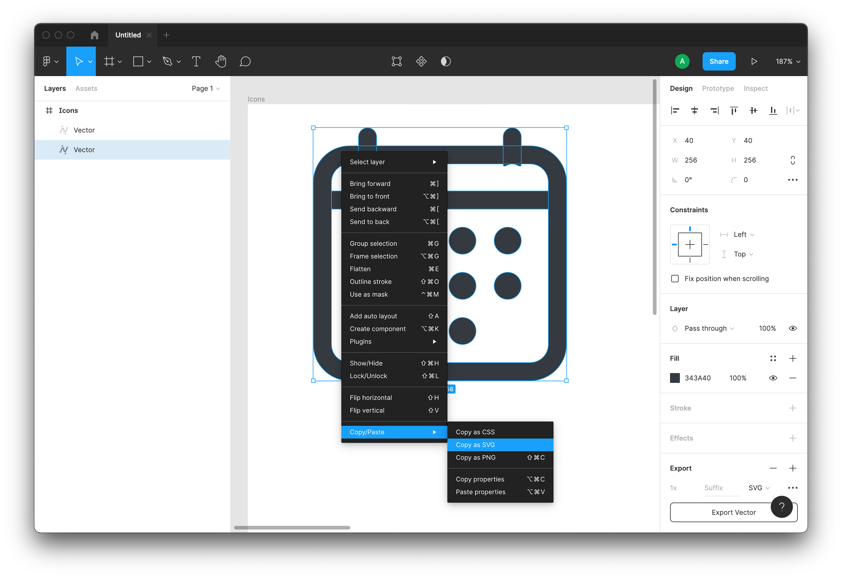
Ah, a figma file, that works, we just need to extract the SVG path content of the icons. If you receive pre-exported .svg files, that's even better.
If your designers give you an assets.zip folder with images like

it's probably best to transfer it where it belongs: /dev/null, and get replacement designers.
At a glance a SVG icon looks like this
We need to extract all the path data <path d="{{ this is the stuff }}" ... />
We'll transfer all the path data into a single string
const pathData = "M36.5714 36.5714C26.4725 36.5714 ..." + "M18.2857 64H237.714V82.2857 ..." + ...
This works as long as paths are simple, don't use special effects like blend modes or shadows.
Construct our custom iconObject to be exported as so
I prefer to put all exported icons in a @fortawesome/custom-icons folder located at project root. If the compiler is setup to resolve base paths, it is convenient to import from one location.
Now simply use the icon as such:
It'll support any properties that FontAwesomeIcon offers, such as color, size, rotate, flip, inverse, fixedWidth etc.

Note that for best results, designers should create their icons with simpler paths, and not use special effects like shadows or blend modes. It's also best to create them with a standard square size (say 256px or 1024px) in mind that can be up or down scaled based on use, or used with a pulse or spin modifier.
Here's an example for the Bitcoin logo:
Usage:
Preview:
